Thesis Project
Type Design:
Chinglish
After all the walking, it was finally time for lunch. The first thing that caught my eye was the "chop suey" typeface on all the takeout boxes, something I had never noticed before. Although I found this typeface aesthetically pleasing, it attempts to mimic Chinese calligraphy by blending English with Chinese strokes, yet it fails to capture either form or spirit. This reminded me of a Chinese artist I admire, Xu Bing, and his Square Type Calligraphy.
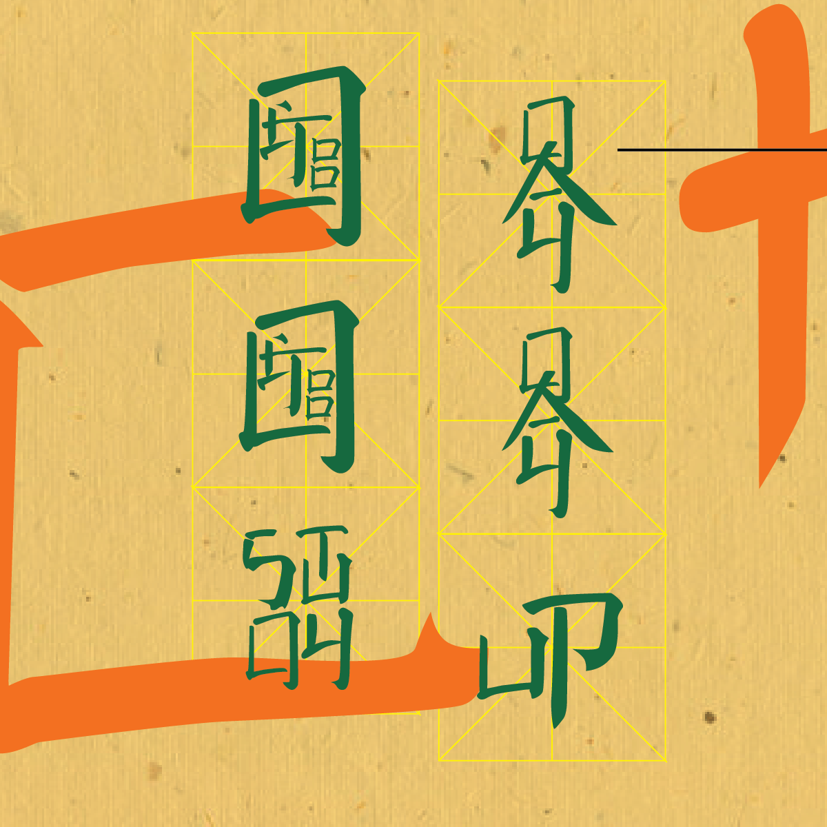
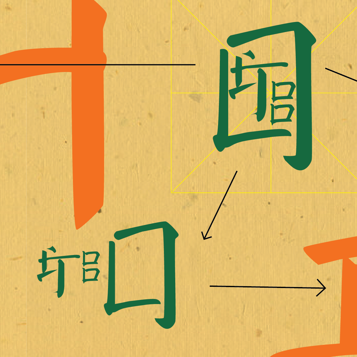
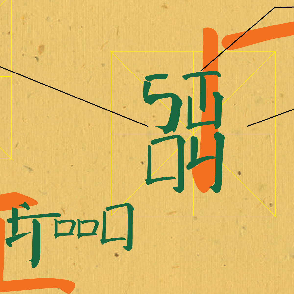
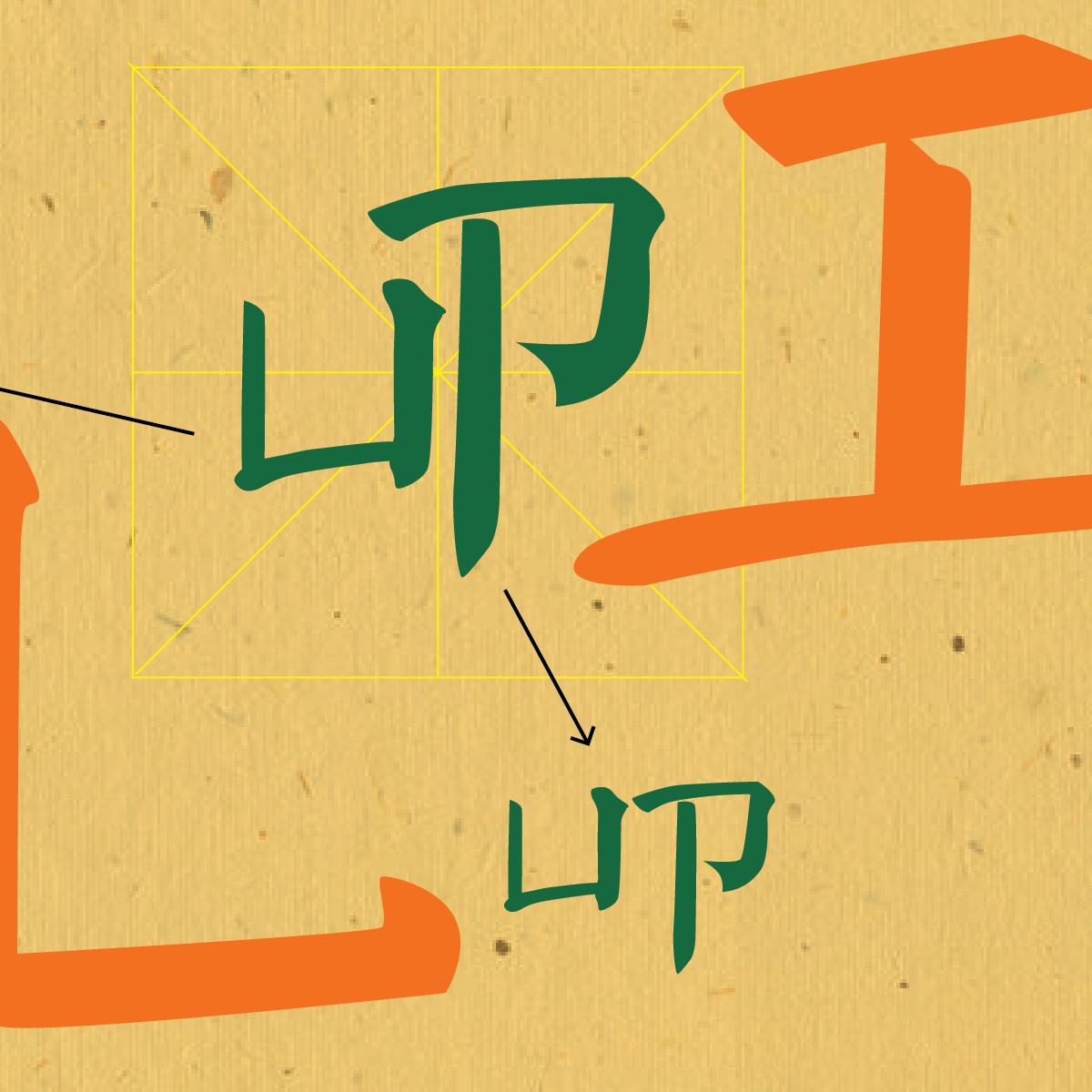
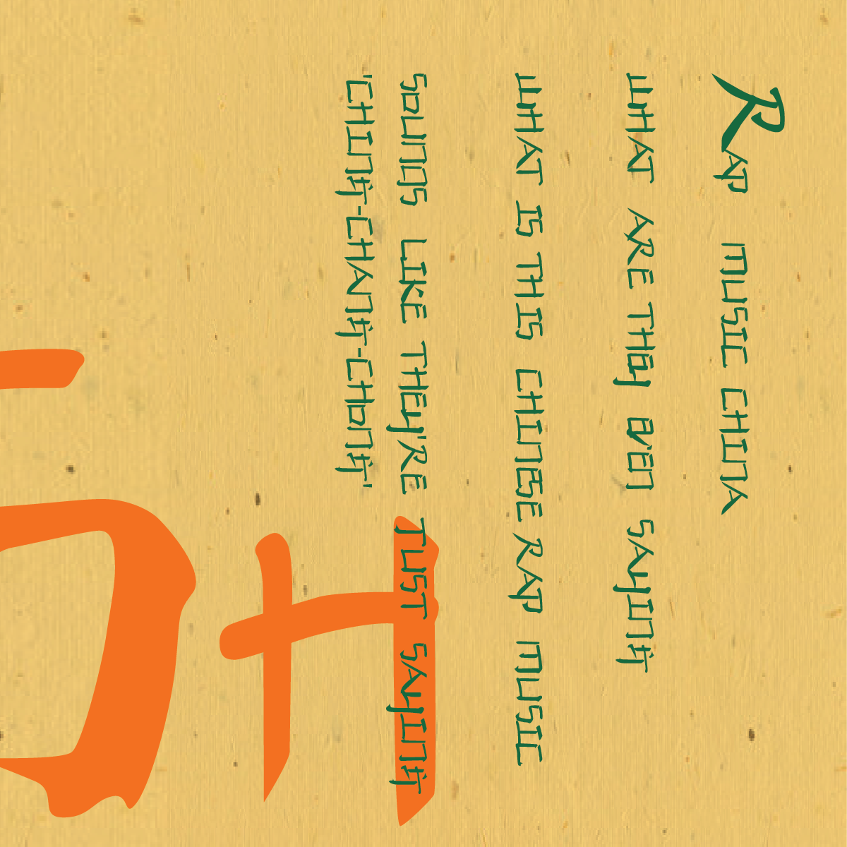
I decided to adapt and document his system under the name 'Chinglish,' where all English letters are composed of components from Chinese characters. This system, a readable "true script," intertwines the art of Chinese calligraphy with English lettering, creating a new linguistic concept. This evokes a mental epiphany as the audience grapples with the initial confusion, leading to a deeper appreciation of this East-meets-West calligraphy. In the specimen scroll, I used Chinglish words like "good good study, day day up" to demonstrate the decomposition of overlaid English letters.
Don't they look just like authentic Chinese when they stack up?
They can also stand alone. The concluding passage is a lyric from the Chinese hip-hop track "Made in China."